
WP Terms Popup Designer
Adjust the appearance of your popups without writing code or modifying your WordPress theme
Our WP Terms Popup Designer add-on is the perfect solution for WordPress website owners using the WP Terms Popup plugin. Designer lets you make adjustments to the appearance of your popups without editing your theme or writing CSS markup.
With Designer installed and activated, the popup interface automatically includes a new settings panel to help you control various settings related to presentation.
Purchase the Designer add-on and change the design elements of your popups without writing any code.
WP Terms Popup Designer Settings
Let’s go through each of the settings available in the Designer add-on in more detail. This breakdown should help you learn all the ways you can control your popup’s appearance once you have the Designer add-on installed. Remember, all of these settings are located on the WP Terms Popup interface in the WordPress admin.
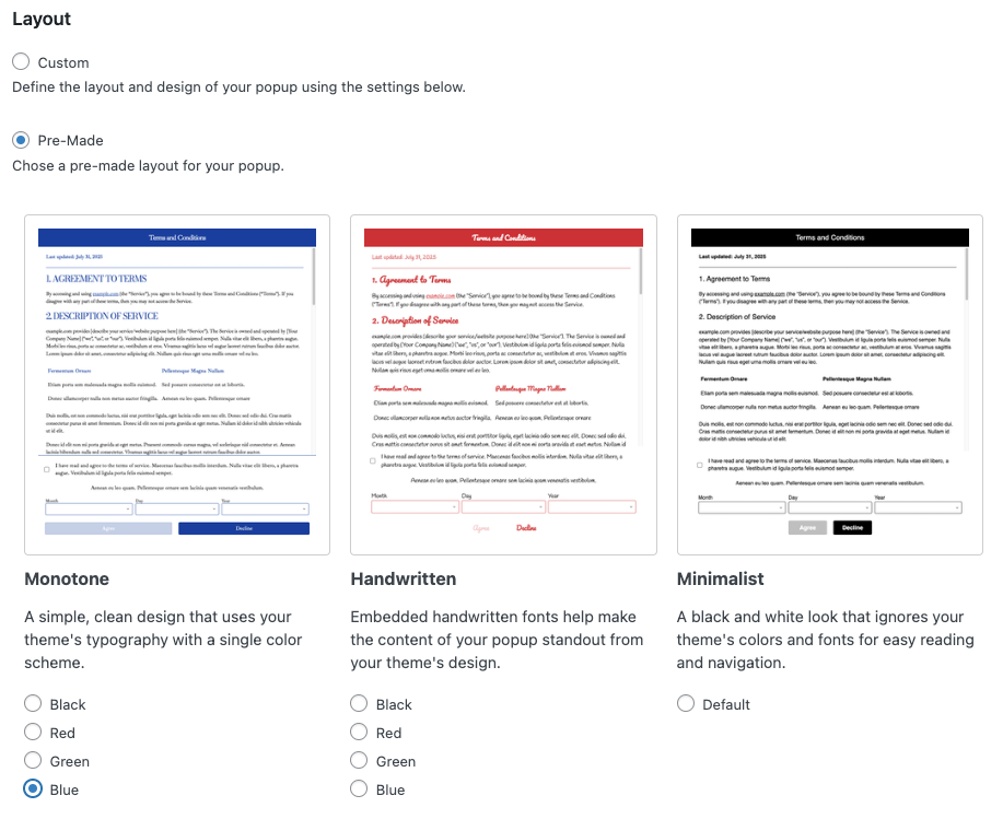
Layouts
Designer lets you choose between two layouts: Custom or Pre-Made. A Custom layout is defined by you through the various settings provided by Designer that we will discuss below. Pre-Made layouts are designed for you already, with some color choices when applicable. You can adjust some Designer settings with a Pre-Made layout as well, but for the most part, your popup’s look and feel is handled for you.
Popups
The Popups panel lets you dictate the width, height, and position of the popup as it appears on your website. You can also round the corners of the popup itself and better match the design of similar elements of your WordPress theme.
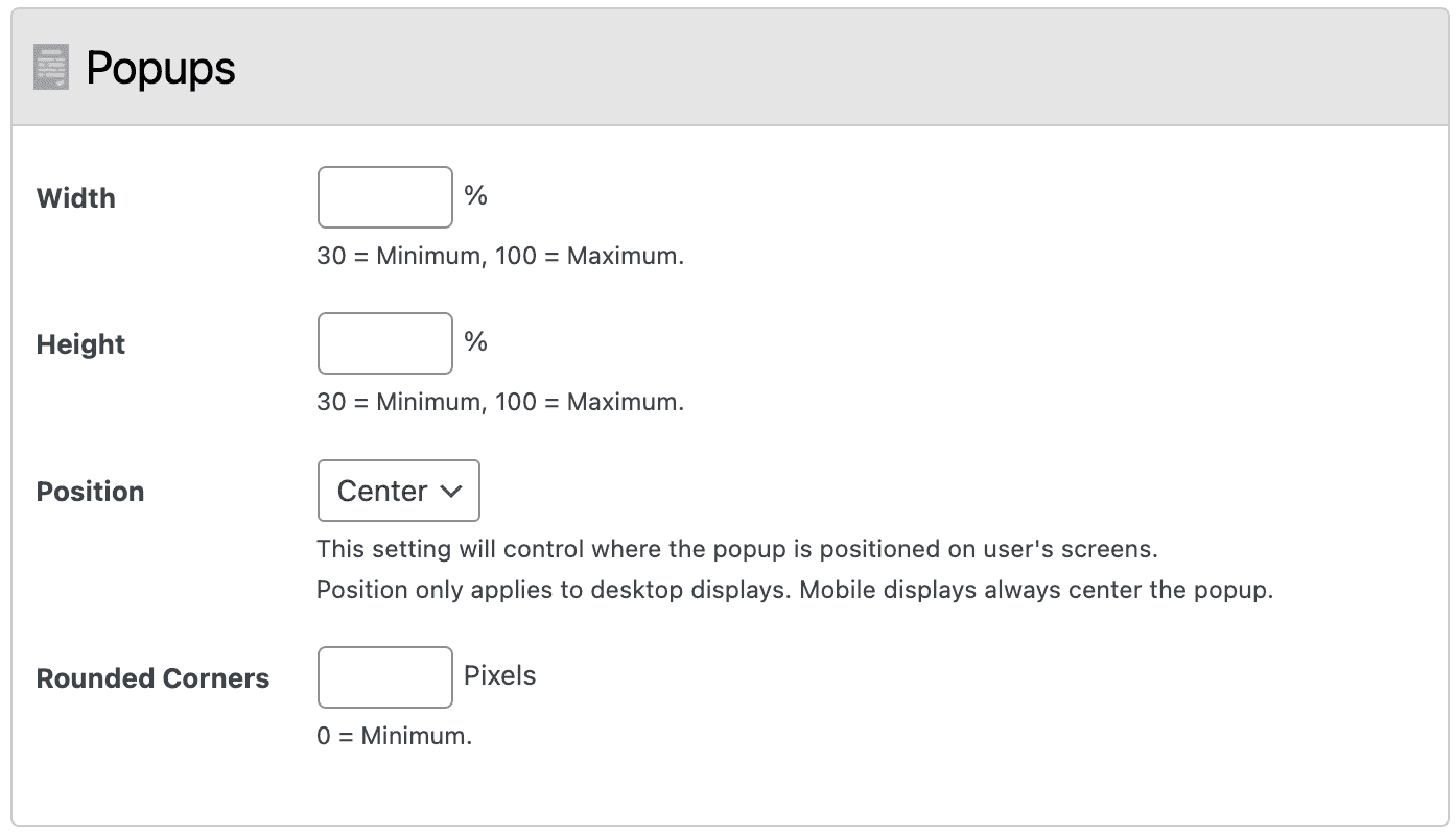
Width
Control how wide the popup is on your website in relation to the width of the browser window.
Height
Set how tall the popup is on your website in relation to the height of the browser window.
Position
This setting controls where the popup is positioned on the user’s screen. Your options are Center, Left, or Right. Note: this setting only applies to desktop displays. Mobile displays will ignore this setting and always center the popup.
Rounded Corners
With this setting, you can round the corners of the popup. This is useful if your current WordPress theme already features rounded corner elements, and you want your popup’s appearance to match.
Header
The Header panel lets you control the top, or title portion, of your popup. You can set the background and text color, text size, alignment, and much more.
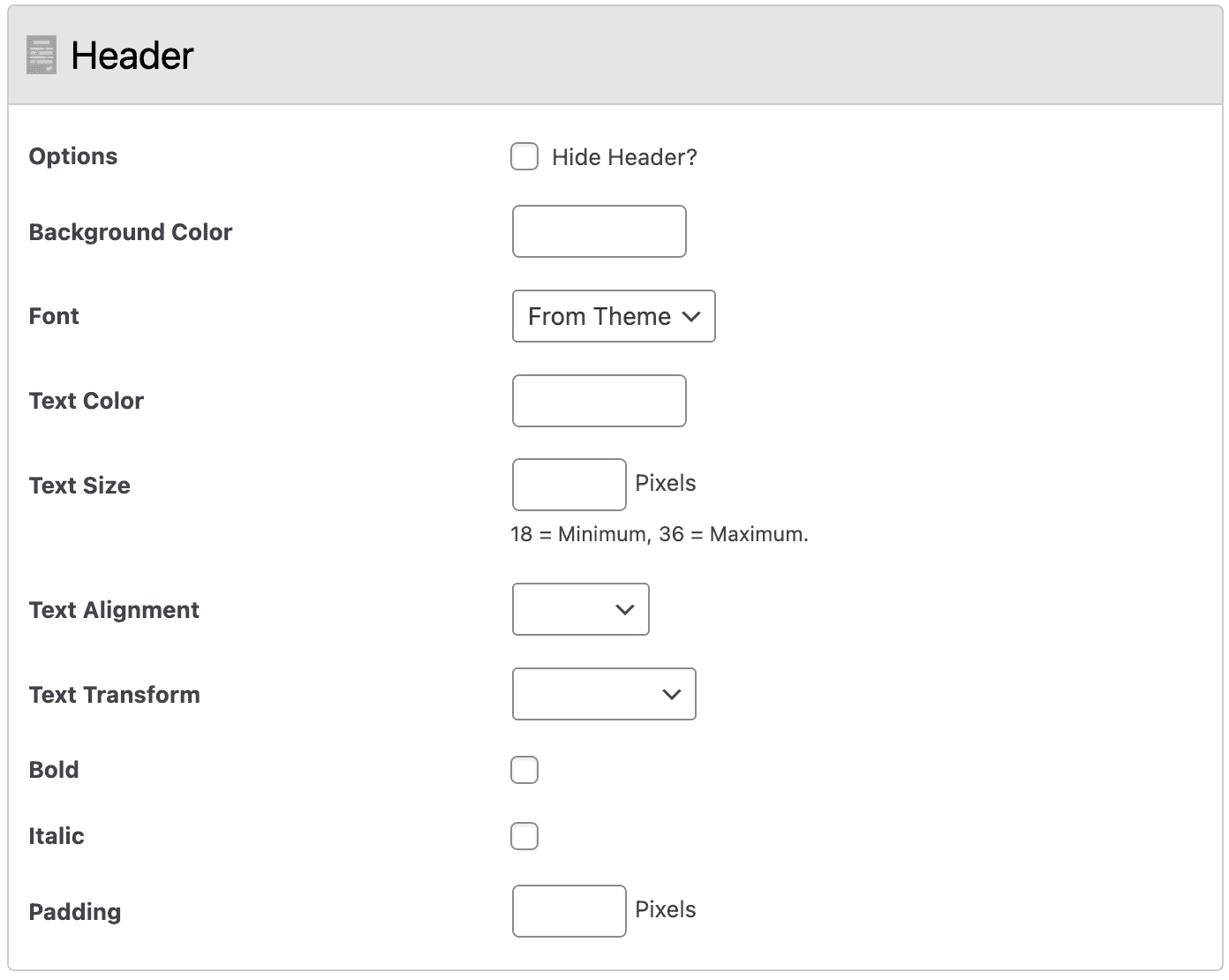
Options
The main option is to hide the header entirely. This will stop the header (and the popup text inside) from being displayed.
Background Color
Use the built-in color picker tool to set the background color of your popup’s header to match the branding of your website.
Font
You can change the font used in the popup header by selecting one of the following choices: From Theme (the default font your WordPress theme uses), Serif, Sans-Serif, Monospace, or Cursive.
Text Color
Use the built-in color picker to set the color of the text in your popup’s header.
Text Size
Decide, in pixels, how large the popup title appears in your header. The minimum value is 18 pixels and the maximum value is 36 pixels.
Text Alignment
Control the alignment of your popup title in the header: Center, Left, or Right.
Text Transform
Force the popup title to transform with one of three options: Capitalize, Uppercase, or Lowercase.
Bold
Make the text in your popup header bold.
Italic
Make the text in your popup header italic.
Padding
Control how much extra white space pads your popup title text in the header. This value, in pixels, applies to the top, right, bottom, and left of the text.
Body
The Body settings let you control the elements of the main content container of your popup. You can set the background and text color, as well as the alignment and size of the text. You can also change the amount of spacing, or padding, around the popup’s content.
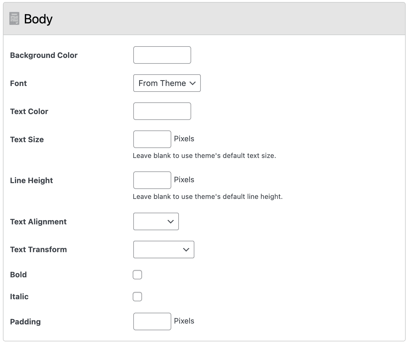
Background Color
Use the built-in color picker tool to set the background color of your popup’s body to match the branding of your website.
Font
You can change the font used in the popup body’s text by selecting one of the following choices: From Theme (the default font your WordPress theme uses), Serif, Sans-Serif, Monospace, or Cursive.
Text Color
Use the built-in color picker to set the color of the text in your popup’s body.
Text Size
Decide, in pixels, how large the text appears in the popup’s body.
Text Alignment
Control the alignment of your popup body’s text: Center, Left, or Right.
Text Transform
Force the popup body’s text to transform with one of three options: Capitalize, Uppercase, or Lowercase.
Bold
Make the text in your popup’s body bold.
Italic
Make the text in your popup’s body italic.
Padding
Control how much extra white space pads your popup body’s text. This value, in pixels, applies to the top, right, bottom, and left of the text.
Dropdowns
WP Terms Popup comes with an age verification system that relies on dropdowns. These dropdowns let users enter in their date of birth. The Designer add-on has settings for controlling the display of those dropdowns. You can control their color, size, font, and positioning.
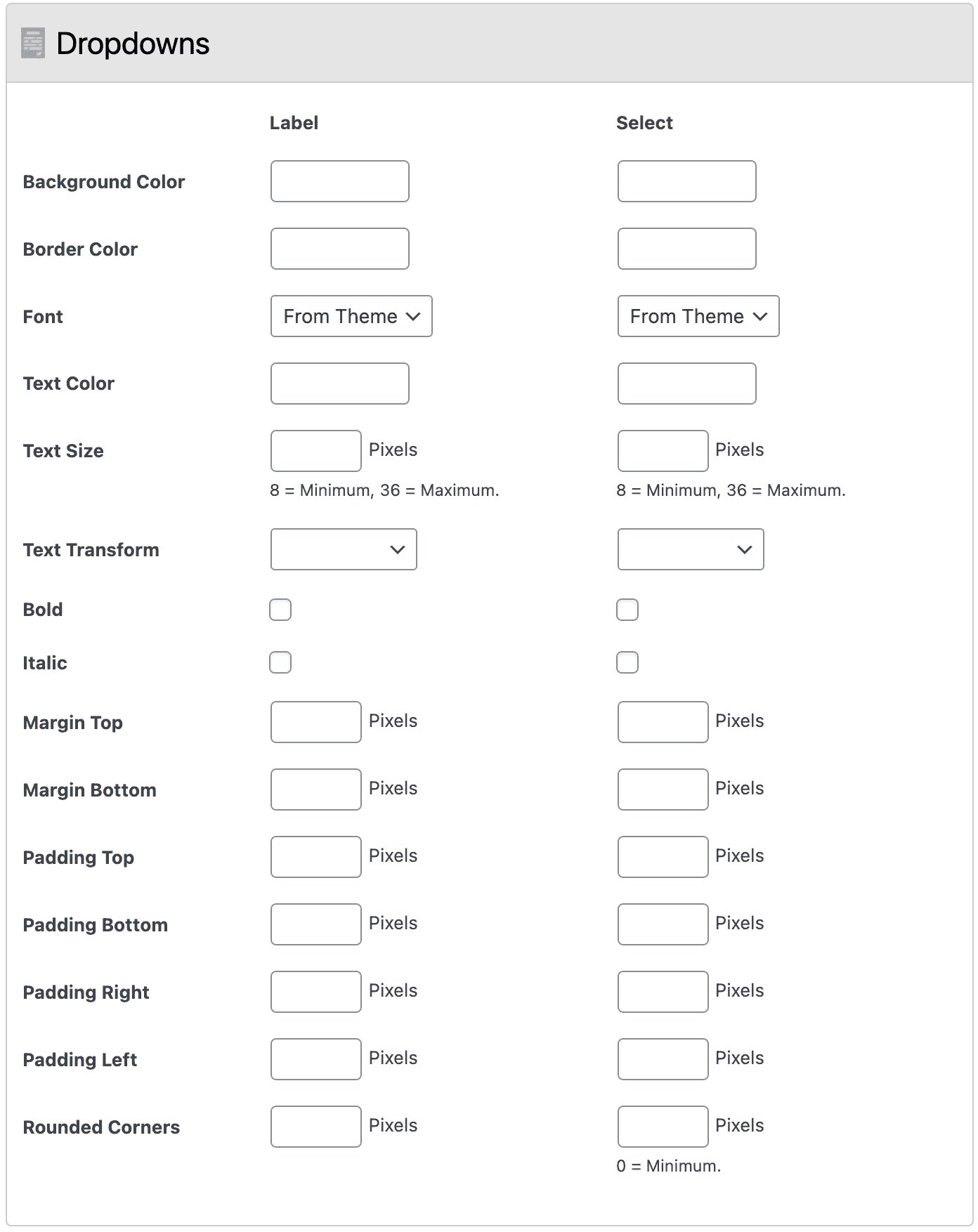
Background Color
Use the built-in color picker tool to set the background color of the dropdown labels and select inputs. This is an easy way to help make your popup’s design match your website’s branding and theme.
Border Color
The built-in color picker can help you select specific colors for the border around the dropdown label and select input.
Font
You can change the font used in dropdown labels and select inputs by selecting one of the following choices: From Theme (the default font your WordPress theme uses), Serif, Sans-Serif, Monospace, or Cursive.
Text Color
Use the built-in color picker to set the color of the dropdown labels and select inputs text.
Text Size
Decide, in pixels, how large the text appears in the dropdown labels and select inputs. The minimum value is 8 pixels and the maximum value is 36 pixels.
Text Transform
Force the text of dropdown labels and select inputs to transform with one of three options: Capitalize, Uppercase, or Lowercase.
Bold
Make the text of dropdown labels and select inputs bold.
Italic
Make the text of dropdown labels and select inputs italic.
Margin (Top and Bottom)
Control the margin at the top and bottom of each dropdown’s label and select input.
Padding (Top, Bottom, Right, and Left)
Control the padding of each dropdown’s label and select input.
Rounded Corners
With this setting, you can round the corners of the popup. This is useful if your current WordPress theme already features rounded corner elements, and you want your popup’s appearance to match.
Buttons
The Buttons panel gives you plenty of control over the style and function of the agree and decline buttons inside your popup. You can define the buttons’ background and text color. Change the size of the text, the padding inside each button, and round button corners. The Buttons panel lets you reverse the order in which the buttons are displayed, or remove the decline button from your popups entirely.
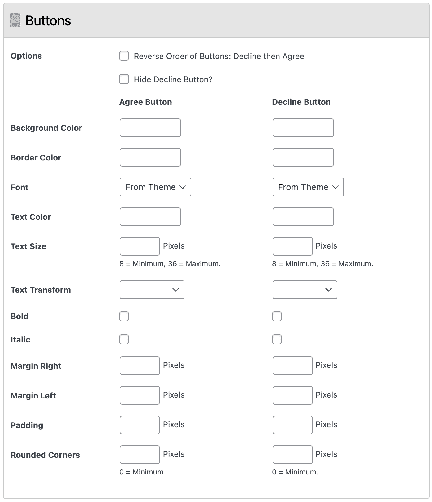
Options
The Buttons panel has two options. First, you can reverse the display of the buttons so that the Decline button comes before the Agree button. Second, you can hide the Decline button entirely.
Background Color
Use the built-in color picker tool to set the background color of the Agree and Decline buttons. This is a great way to make your popup’s design similar to your site’s theme and your company’s branding.
Border Color
The built-in color picker can help you select specific colors for the Agree and Decline buttons.
Font
You can change the font used in the Agree and Decline buttons. Simply select one of the following choices: From Theme (the default font your WordPress theme uses), Serif, Sans-Serif, Monospace, or Cursive.
Text Color
Use the built-in color picker to set the color of text inside the Agree and Decline buttons.
Text Size
Decide, in pixels, how large the text appears inside the Agree and Decline buttons. The minimum value is 8 pixels and the maximum value is 36 pixels.
Text Transform
Force the text of the Agree and Decline buttons to transform with one of three options: Capitalize, Uppercase, or Lowercase.
Bold
Make the text of the Agree and Decline buttons bold.
Italic
Make the text of the Agree and Decline buttons italic.
Margin (Right and Left)
Control the margin at the left and right of each button.
Padding
Control the padding around the text of each button.
Rounded Corners
Round the corners of the Agree and Decline buttons.
Background
The Designer settings panel for Background gives you control over what happens behind your popup. You can set the background color, its transparency level, and blur the elements of your site that appear underneath your popup.
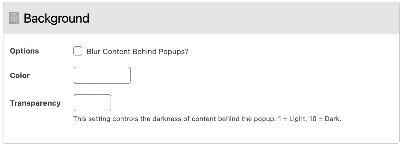
Options
The main option for the Background panel is to blur the elements behind your popup. This can be a great way to keep your site’s content visible, but obscured, before a user agrees to your popup.
Color
Use the color picker to decide what color the underlay, behind your popup, is. This is an easy way to use the Designer add-on to help make your popup experience match your current theme or branding.
Transparency
This setting lets you dictate how transparent the underlay behind your popup is.
Appearance
The Appearance panel gives you the ability to have the Designer add-on trigger the display of your popup whenever a specific element of your site comes into view. Until your trigger element is in view, your popup will remain hidden to your visitor. Note: this is an advance features that assumes you have an understanding of how your current WordPress theme is constructed.
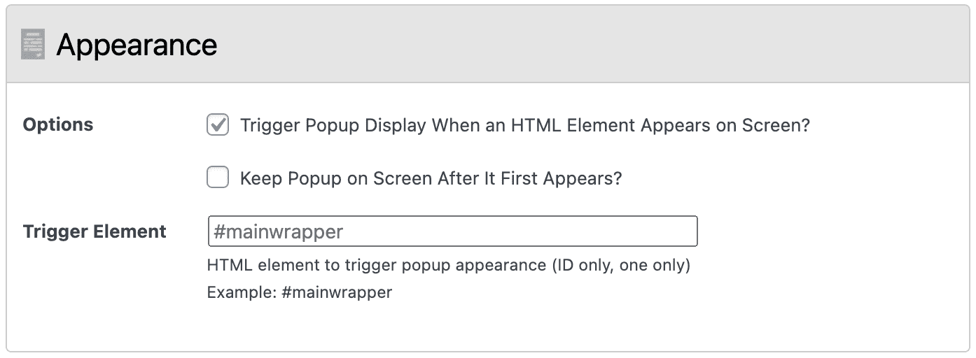
Options
There are two options in the Appearance panel. First, you can decide if you want your popup to display when a specific HTML element appears. Second, if you are using the first option, you can decide to make the popup remain on the screen after its appearance is triggered.
Trigger Element
If you have chosen the first option, you must define which HTML element’s appearance will trigger the popup to display.
Get more control of your popup’s appearance with WP Terms Popup Designer. Perfect for people who don’t code.
Designer is regularly being updated with new features and additions to help make customizing your popups even easier.
Frequently Asked Questions
Are there any requirements for Designer to work?
You will need version 1.3.0 or later of our free WP Terms Popup plugin installed for Designer to work correctly. Older versions of WP Terms Popup are incompatible with Designer.
I purchased a copy of WP Terms Popup Pro before the release of Designer. What can I do to replace my old plugin with this new one?
WP Terms Popup Pro customers are free to contact us via our Support form for assistance in upgrading to Designer free of charge.
How can I get the blur feature working correctly? I can’t figure out how to identify the correct wrapper value?
Contact us through our Support form (make sure you have your License Key handy) and we’ll be happy to help. This process usually takes some trial and error based on how your theme is constructed.